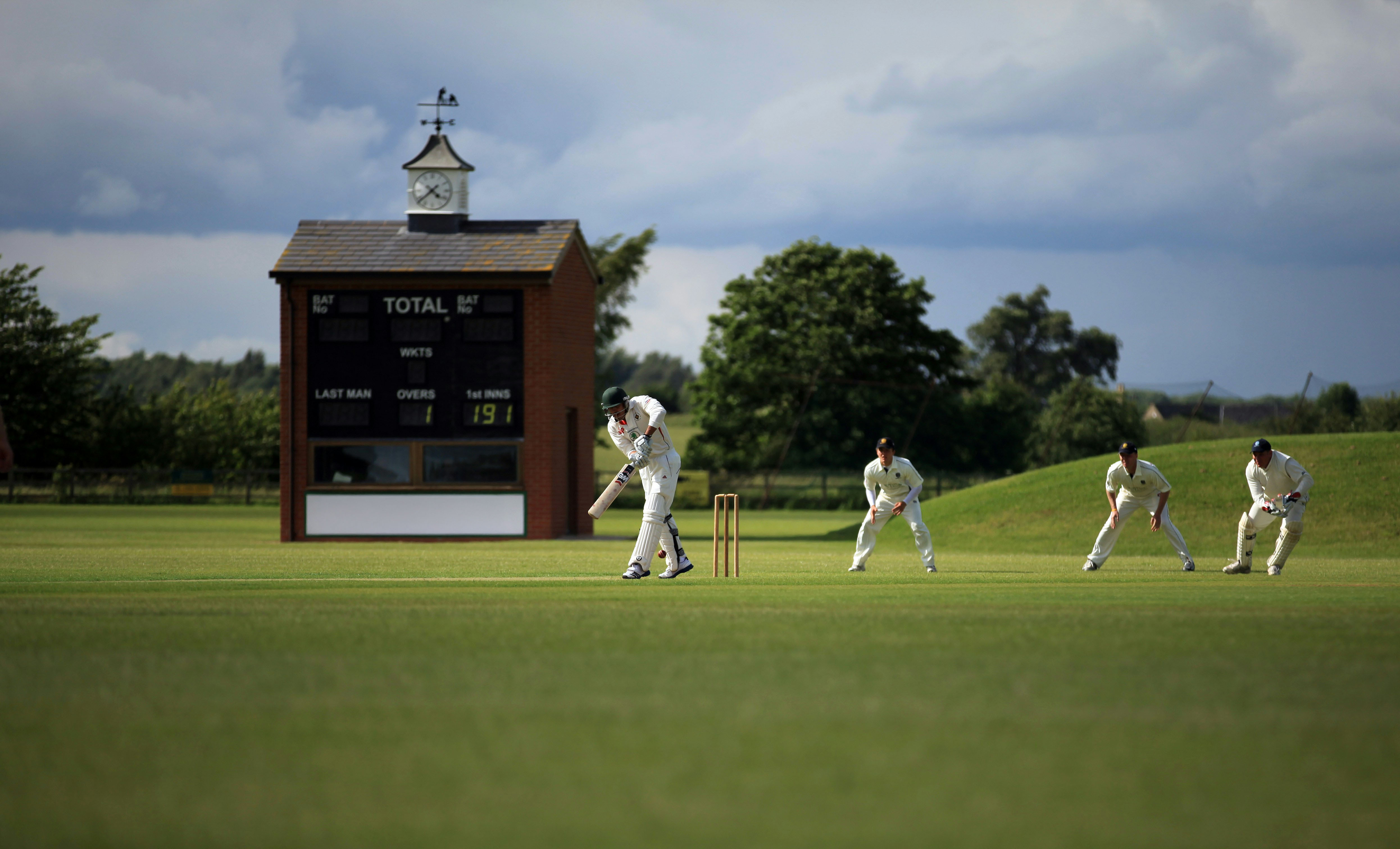
Modernising heritage with a fresh, unified identity.
This rebrand project focused on evolving the visual identity of a local cricket club - bringing new energy to a long-standing institution while maintaining a connection to its roots. The aim was to create a cohesive look that spoke to both tradition and progression.
As Creative Lead, I refined the club’s original logo, modernising its details for clarity and consistency. Alongside this, I developed a contemporary logo for the senior team and a distinct yet complementary version for the junior squad, ensuring both identities felt part of the same visual family.The result is a refreshed, flexible brand system that reflects the club’s community spirit and ongoing evolution - a design that honours where they’ve come from while looking confidently toward the future.